23 June 2022

Lines of not-very-good fit

Does anyone teach lines of best fit 'properly' in lower secondary school? I think whenever I’ve seen this concept taught, or taught it myself, it’s always been a bit wrong.

Typically, students are given a scatterplot, or they draw one themselves, and are asked to draw a straight line on top of it, by eye, but the instructions for how they are supposed to draw this line can be a bit vague. Maybe the teacher says something like, “The 'line of best fit' goes roughly through the middle of all the scatter points on a graph.” (BBC Bitesize: https://www.bbc.co.uk/bitesize/guides/zrg4jxs/revision/9) I guess this is kind of right, but I think that any student hearing this is bound to misinterpret what this is supposed to mean.

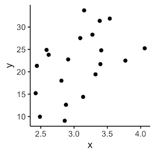
Suppose you give students the $x$-$y$ scatterplot below (Note 1), and ask them to draw the best straight line they can that takes account of all these points. 

Of course, they could draw something like this, which “goes roughly through the middle of all the scatter points” (10 points on either side).

But, unless they are trying to be awkward, they will probably be much more likely to draw something like this.

It 'goes through the middle' and is the kind of thing that the teacher is wanting (Note 2).

But, if you then display an accurate trend line, say using Excel (in black below), then it will be a bit off from what the students have drawn.

Here they are together, so you can see the difference:

It is easy to put this discrepancy down to human error. The computer draws the best possible line, and the line we draw by eye is bound to be not quite right. Students might over-attend to a few prominent outliers, rather than really base their line on where the overall mass of the points is located. So there is nothing to worry about.

But there is more than random error going on here. I claim that the students are not even trying to draw the line that the computer is drawing. For example, if we switch the variables around (interchange the axes), presumably this would/should make no difference at all to the line that the students are trying to draw, relative to the positions of the points – it should just be a reflection of their line in the diagonal $y=x$. But the computer will give you a completely different regression line, because the regression line of $y$ on $x$ is in general quite different from the regression line of $x$ on $y$ - and sometimes dramatically so. The regression line of $x$ on $y$ is shown in blue below, on top of the black regression line of $y$ on $x$.

The black line minimises the sum of the squares of the vertical distances of the points from the line, whereas the blue line minimises sum of the squares of the horizontal distances of the points from the line. We should not expect the resulting lines to be the same. The black line gives the best linear prediction of the $y$ value, given the $x$ value; the blue line gives the best linear prediction of the $x$ value, given the $y$ value. The two lines answer two different questions.

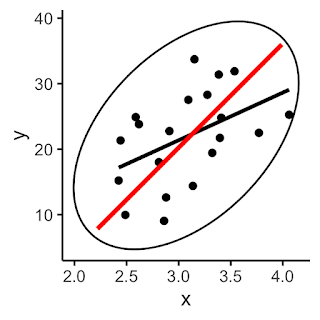
And neither of these questions is likely to be what the students are thinking about. The line the students are likely to be aiming for is the principal axis of the data. If we draw an ellipse around our data points, what the students are presumably trying to do is essentially find the major axis of this ellipse.


If we compare the principal axis (in red below) with the correct regression line of $y$ on $x$ (in black), we can see that they are not the same.

If you consider thin, vertical slices of the ellipse, the black line approximately bisects these, and is close to the mean $y$-value of the points that are near to that value of $x$. Relative to this, the red line underestimates $y$ for low values of $x$ and overestimates them for high values of $x$.

In school mathematics, lines of best fit are used to predict one variable from the other, so it's really regression lines that we need, not principal axes. (And, indeed, really we should use a different line to predict $y$ from $x$ [part (b) of the typical exam question, in which part (a) is to draw the line of best fit] from the line we use to predict $x$ from $y$ [part (c) of the typical exam question].) Even when the regression line and the principal axis happen to be close to each other, conceptually they are quite different. The principal axis minimises the sum of the squares of the (perpendicular) distances from the points to the line, whereas the ordinary-least-squares regression line minimises the sum of the squared vertical distances from the points to the line. It can be interesting to devise scenarios where these two lines are very similar and very different.

From a school teaching point of view, does this matter, or is it unnecessary quibbling? I have found that this discussion comes up sometimes when students complain that the line of best fit that the computer is producing ‘looks wrong’, especially when there are lots of points, and the correlation is fairly strong. They think they can draw a better one, and are puzzled why the computer is clearly giving them 'wrong' lines. The problem here is that the students have been misled about which line they should be aiming for, and Gelman and Nolan (2017, Chapter 4) have a nice approach to addressing this.

Maybe it is a relatively small point to worry about, but surely it would be a bit of a problem if students drawing something closer to the black line above were being penalised or criticised over those drawing something more like the red line.

Questions to reflect on

1. How concerned are you about this distinction between regression lines and principal axes?

2. What, realistically, might be done to address this in school-level mathematics?

3. Are there other examples in school mathematics where it is usual to teach things 'a bit wrong'?

Notes

1. The data used in this blogpost is available at: https://www.foster77.co.uk/Data%20for%20line%20of%20best%20fit%20blogpost.csv

2. Students sometimes have a strong tendency to avoid going directly through any of the points. They have been told that they are not meant to 'join up' the points, and, as if to prove this, they try to keep away from any actual points altogether. Similarly, they may feel that it would be wrong to allow the line to pass directly through the origin, so they act as though the origin must be avoided at all costs.

Reference

Gelman, A., & Nolan, D. (2017). Teaching statistics: A bag of tricks. Oxford University Press.


09 June 2022

Motivation for measurement

Optical illusions are almost universally intriguing. Young children can completely get them, but they can fascinate adults too. There is something captivating about being tricked by your eyes. And I think they can provide a great opportunity for motivating some geometry.

Topics in mathematics that involve accurate measurement can sometimes feel a bit unmathematical - more science than mathematics. For example, why is 'scale drawing' a topic in mathematics? Is this just a hangover from the days when 'technical drawing' was a marketable skill that was taught in schools? Converting scales is a useful application of ratio, but what is the mathematical purpose of making accurate drawings? Loci and construction are important topics for understanding concepts in geometry, and the central idea that compass constructions are 'exact in principle' seems to me to be important. But should it matter whether students can execute a perfect circle with their compasses or draw an angle of $35^\circ \pm 1^\circ$ using a protractor? Arguably, making neat constructions may depend more on the quality of the student's instruments (such as how well-tightened the screw on their compasses is) and on basic dexterity than on any mathematically-relevant skill. The beauty of mathematics is the ability to carry out exact calculations that mean that a correct mathematical sketch not drawn to scale is generally as useful as, or more useful than, an accurate scale drawing. For example, in an astronomical scenario (e.g., calculating the distance to the sun) we can sketch a 1 by 20,000 right-angled triangle, and this is much more helpful than trying to draw this to scale! In mathematics, we develop ways to calculate so that we don't need to make accurate drawings, so perhaps the main purpose of scale drawing is to show students how slow and tiresome things would be without mathematics (a Dan Meyer 'headache-aspirin' situation, see Meyer, 2015)?

Nevertheless, there are times when we need students to measure lengths and angles, and it is great when we can find purposeful ways to practise these skills (see Andrews, 2002). I think finding scenarios where there is a real (i.e., uncontrived) need to measure can be quite difficult, but optical illusions can be really helpful for this - and are fun in their own right.

There is a good list of many kinds of optical illusions at https://en.wikipedia.org/wiki/List_of_optical_illusions, and this includes things that are extremely weird, such as Ames room (https://en.wikipedia.org/wiki/Ames_room). These might be fun to look at and talk about. However, I focus below on some examples of optical illusions that could have obvious, immediate relevance in motivating some primary or secondary school geometry and measurement.

The Ebbinghaus illusion (https://en.wikipedia.org/wiki/Ebbinghaus_illusion) is a nice one. The orange discs below are equal in size, but don't look it.

This is just crying out for some measurement with a ruler. Can the diameters really be equal? But the centres of the circles are not marked, so how could you be sure you were accurately measuring the diameter, and not some other chord?

The Delboeuf illusion (https://en.wikipedia.org/wiki/Delboeuf_illusion) is similar. The black discs are in fact equal, but the right-hand one looks larger:

The Moon illusion is a nice variation on this (https://en.wikipedia.org/wiki/Moon_illusion).

Without being prompted to do so, when presented with these illusions, students reach for their rulers. And so, of course, if you want every student to do the measuring, then you need to provide the images on paper, as displaying them on the screen allows only one student to do it on behalf of everyone else.

Students could also attempt to create their own drawings, some of which are illusory (something looks bigger but isn't) and some not (something looks bigger and is), and see if other students can decide which are which by eye - followed by measuring to check.

The Müller-Lyer illusion (https://en.wikipedia.org/wiki/M%C3%BCller-Lyer_illusion) provides motivation for measuring the lengths of line segments. The two horizontal portions below are equal in length, but don't look it!

Similar opportunities are provided by the Ponzo illusion (https://en.wikipedia.org/wiki/Ponzo_illusion),

Tony Philips, National Aeronautics and Space Adm., Public domain, via Wikimedia Commons

the Sander illusion (https://en.wikipedia.org/wiki/Sander_illusion), where the two purple diagonals below are actually equal in length,
where the vertical line segment looks longer, but isn't.

Asking students to attempt to draw a square by eye, using a straight edge (i.e., not a scaled ruler), can be revealing. Then the students measure everyone's and do some statistics to see whether, among the various drawings produced, 'squares' that are tall/narrow are more prevalent than ones which are short/wide. (The easiest way of keeping track of the orientation of each piece of paper is to have the students write their name at the top.) There are similar opportunities for statistical analysis in devising a way to decide how to judge the quality of people's freehand circles (see Foster, 2015, and Bryant & Sangwin, 2011).

The café wall illusion (https://en.wikipedia.org/wiki/Caf%C3%A9_wall_illusion) is a bit more sophisticated, and this can be a good opportunity to encourage students to use precise language. What exactly do they mean by 'wavy', 'wonky' or 'not straight'? Do they mean sloping straight lines or curves? "Say what you see" can be a really a useful prompt to use with these figures, and you can follow up with requests for greater clarity.

Fibonacci, CC BY-SA 3.0 http://creativecommons.org/licenses/by-sa/3.0/, via Wikimedia Commons

The Zöllner illusion (https://en.wikipedia.org/wiki/Z%C3%B6llner_illusion) provides another opportunity for students to check parallelness,

Fibonacci, CC BY-SA 3.0 http://creativecommons.org/licenses/by-sa/3.0/, via Wikimedia Commons

and the Hering illusion (https://en.wikipedia.org/wiki/Hering_illusion) is another example:

Fibonacci, CC BY-SA 3.0 http://creativecommons.org/licenses/by-sa/3.0/, via Wikimedia Commons

For working with polygons, the Ehrenstein illusion (https://en.wikipedia.org/wiki/Ehrenstein_illusion) is useful. What do we need to check to see if the shape really is a square? Is it enough just to measure the lengths of the four sides? Is it enough just to check that the angles are all right angles (and how many do we need to measure to do this?)? (The Orbison illusionhttps://en.wikipedia.org/wiki/Orbison_illusion - provides similar opportunities.)

Often, students address measurement objectives by spending lesson time measuring arbitrary line lengths or angles on a sheet, merely to improve their skill at measurement. Optical illusions can provide a rich context for doing similar work, where there is a motivation to discover whether, say, two lengths really are the same or not. I find that students will measure much more accurately, and with considerably more enthusiasm, when it has some purpose behind it, and I would call tasks like these mathematical etudes (http://www.mathematicaletudes.com/) for measurement.

Questions to reflect on

1. Do you find these optical illusions engaging? Would your students?

2. How could you use these ideas to promote a need for measurement with one of your classes?

3. What other tasks make measurement a meaningful mathematical activity?

References

Andrews, P. (2002). Angle measurement: An opportunity for equity. Mathematics in School, 31(5), 16–18. https://nrich.maths.org/content/id/2855/AngleMeasurement.pdf

Bryant, J., & Sangwin, C. (2011). How round is your circle? Princeton University Press.

Foster, C. (2015). Exploiting unexpected situations in the mathematics classroom. International Journal of Science and Mathematics Education, 13(5), 1065–1088. https://doi.org/10.1007/s10763-014-9515-3

Meyer, D. (2015, June 17). If math is the aspirin, then how do you create the headache? [Blog post]. https://blog.mrmeyer.com/2015/if-math-is-the-aspirin-then-how-do-you-create-the-headache/

Teaching specific tactics for problem solving

This is my final blogpost, as my year as President of the Mathematical Association draws to a close, so I've allowed myself to go on at ...