22 December 2022

Mixing the dimensions in models of number

Not all commonly-used representations of number are necessarily equally helpful. We shouldn't just assume that anything 'visual' will automatically be helpful - some representations might even be counterproductive.

An emphasis on conceptual understanding in mathematics often seems to be linked with the use of visual representations. If you care about helping your students to make sense of mathematics – as opposed to just following standard, symbolic procedures – then you are likely to be keen on visual models. If a picture can paint a thousand words, then in mathematics a helpful visualisation might easily surpass multiple sentences of wordy explanation, whether written or oral, or many lines of mathematical symbols. It may also be that visualisation offers ways to support students who are more likely to be disadvantaged by traditional approaches to learning mathematics (Gates, 2018).

I very much like diagrammatic ways of showing mathematical properties and relationships (e.g., see Mattock, 2019, for a beautiful collection of examples), and some of my favourite books are the volumes of Proofs without Words (Nelson, 1993, 2000, 2016). However, I think a positive view of diagrams can sometimes lead us to be a little uncritical about cases where diagrams may be problematic. We should not just assume that anything ‘visual’ must be a good thing. In particular, if certain representations have the potential to create or embed particular misconceptions, so making understanding harder to achieve, then this is something we should worry about. The fact that students may say that they like certain visual representations is not enough, as it may not be possible for them to be aware at the time of possible problems coming down the line as a result of the representations that they are using. It relies on the teacher to look ahead and consider how future problems might be being set up by what is currently taking place.

I am a big fan of 1-dimensional, ‘linear’ models, such as number lines, and I include in this category any representation that has just one variable or dimension, even if it isn’t drawn in a straight line (see Foster, 2022). So, for me, a circular number line, like on a speedometer or clock, is still a kind of 1-dimensional number line, as is a spiral number line. So is a number track, such as the snaking squares on a snakes-and-ladders board, because all of these are still unidimensional representations (you can only go either forwards or backwards – ignoring the snakes and ladders themselves!). I see all of these as linear, even though they of course have to take up 2-dimensional space, otherwise we wouldn’t be able to see them (Note 1).

However, I think that I am coming round to the view that I am not a fan of 2-dimensional representations of number, because they are inevitably mixed-dimensional, and I think this is quite problematic (Foster, 2022). To explain what I mean, consider ‘algebra tiles’, as embodied in diagrams (or physical or virtual manipulatives) like those shown in Figure 1 (Note 2).


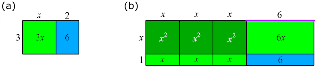
Figure 1. 
Algebra tiles representing (a) $3(x+2)\equiv3x+6$  and (b) $(3x+6)(x+1)\equiv3x^2+9x+6$

In Figure 1a, the area 6 is represented by a blue 2 × 3 rectangle, and, in Figure 1b, we have another area of 6, this time represented by a blue 1 × 6 rectangle. This is fine, because it seems perfectly reasonable to say that both of these represent the same number 6 (Figure 2a), because they have the same area as each other. We could break up either one of them and fit it completely into the space occupied by the other. However, my difficulty is that in Figure 1b we also have the number 6 represented by the (1-dimensional) purple line segment at the top right (see Figure 2b), meaning that the same number is represented, in the same diagram, by both a 1-dimensional line segment and a 2-dimensional area.


Figure 2. (a) a reasonable equality; (b) an unreasonable equality


I think this mixed-dimensional feature of area models of number is unfortunate, and becomes quite problematic the more you think about it. A rectangle and a line segment are not just different things (like two different rectangles) – they are different kinds of things. It’s OK if we sometimes represent a number by a 1-dimensional length, and other times by a 2-dimensional area – and we maybe sometimes represent it by all sorts of other things – but to do both of these simultaneously in the same diagram seems like asking for trouble. I am not sure how much relational understanding (Skemp, 1976) can be said to be going on if students have not noticed or thought about this. And this is not something that occasionally happens with representations like these, in certain awkward cases – it happens every time.

I am perfectly happy that there is no dimensional problem with writing an expression like $3x^2+9x+6$, because $x$ is a pure number, without any units, so this is just of the form 'number + number + number', which is equal (unsurprisingly) to 'a number'. But, as soon as you start to represent an expression like this using algebra tiles, it begins to look very much as though you have 'area + area + length', or maybe 'area + length + length'. In Figure 1a, $3x+6$ is 'area + area', but when, in Figure 1b, we want to multiply this expression further by $x+1$, we somehow have to shift our thinking down a dimension, and reconceive $3x+6$ as 'length + length', so that we can multiply it by another ‘length’ (the $x+1$), so as to obtain a quadratic expression, which is now represented as an area. Alternatively, we could retain $3x+6$ as area + area, and multiply it by length + length to give a volume in 3 dimensions, and, although this is tricky to sketch on paper, 3D models can be insightful. But then you are stuck if you want to go any further.

I think this problem is often overlooked, because algebra tiles are often used to multiply two linear expressions, like $x+b$ and $x+d$. We are very pleased with the fact that the leading term in the expansion is $x^2$, and that ‘$x$ squared’ is represented by ‘a square’. This seems great – we visualise an algebraic square by means of a geometrical square – what could be nicer? But, we overlook that the other terms in the expansion have less convenient interpretations – we have a $bx$ and a $dx$ rectangle, and a $bd$ rectangle, and it’s unclear why it’s appropriate for all three of these to be rectangles, given that things very like them were lengths at the beginning.

Even if you restrict ‘algebra’ tiles to numbers, and use them to work out things like $12\times46=(10+2)\times(40+6)=552$, I think you have exactly the same problem. The 2, say, in the original 12 looks visually like a completely different kind of a thing from the 2 in the 552, but they are both meant to be 2 ones. One of the most basic requirements of a good representation is that the same thing (e.g., 2) should be represented by the same thing (e.g., either a line segment of length 2 or a rectangle of area 2, but not both).

There is something nice about the dynamic in a classroom where students are fiddling around with physical algebra tiles, rearranging them and fitting them into rectangles and talking about what they are doing. It seems like just the sort of activity that should develop conceptual understanding. Students are actively manipulating representations that make the mathematical structure visible and figuring out what is possible and what is impossible. But, whether or not the jigsaws get completed, I worry that mixed-dimensional models like this have the potential to be more confusing than helpful.

I have expanded on the argument of this blogpost in Foster (2022).

Questions to reflect on

1. Do you use mixed-dimensional representations of number, like algebra tiles? If so, when and why?

2. What do you think about the concerns I've expressed in this post?

Notes

1. Manipulatives, like Cuisenaire rods or cubes, are harder to classify, because you can do lots of things with them, and not all of these things are 'linear'. For example, you can use them to make rectangles with an area of 12 square units. So I think whether they are ‘linear’ or not depends on what you do with them.

2. To generate diagrams like this conveniently, go to https://mathsbot.com/manipulatives/tiles.

References

Foster, C. (2022). Using coherent representations of number in the school mathematics curriculum. For the Learning of Mathematics, 42(3), 21–27. https://www.foster77.co.uk/Foster,%20Using%20coherent%20representations%20of%20number%20in%20the%20school%20mathematics%20curriculum.pdf

Gates, P. (2018). The importance of diagrams, graphics and other visual representations in STEM teaching. In R. Jorgensen, & K. Larkin (Eds), STEM education in the Junior Secondary: The state of play (pp. 169-196). Springer. https://www.researchgate.net/profile/Peter-Gates-4/publication/319086868_The_Importance_of_Diagrams_Graphics_and_Other_Visual_Representations_in_STEM_Teaching/links/5d094203299bf1f539cef6d3/The-Importance-of-Diagrams-Graphics-and-Other-Visual-Representations-in-STEM-Teaching.pdf

Mattock, P. (2019). Visible Maths: Using representations and structure to enhance mathematics teaching in schools. Crown House Publishing Ltd.

Nelsen, R. B. (1993). Proofs without words: Exercises in visual thinking. The Mathematical Association of America.

Nelson, R. B. (2000). Proofs without words II: More exercises in visual thinking. Washington. The Mathematical Association of America.

Nelson, R. B. (2016). Proofs without words III: Further exercises in visual thinking. The Mathematical Association of America.

Skemp, R. (1976). Instrumental understanding and relational understanding. Mathematics Teaching, 77, 20-26. http://math.coe.uga.edu/olive/EMAT3500f08/instrumental-relational.pdf

08 December 2022

Dividing into thirds

How accurately do things need to be drawn to evidence conceptual understanding? When are accurate drawings helpful and when are they unnecessary?

Suppose that you asked a child to divide a disc into thirds, and suppose they drew something like this:

How would you respond? Are they right? It is only a sketch, after all.

Now imagine an equally scruffy sketch like this:

Full marks this time? I can imagine the second one being treated as more acceptable than the first, even if both were drawn equally accurately.

In fact, here, the first one of these is drawn more accurately into thirds than the second one is. But, might that just be 'luck', and not evidencing a clear understanding of what 'thirds' are? What are we trying to judge here? A small child may have a better eye than me, and be better at estimating equal areas accurately than I am. Is that the thing that matters?

Perhaps the teacher is expecting/hoping to see sectors drawn, and they view parallel lines suspiciously, as they worry that the child might be intending to indicate evenly-spaced lines, as shown below, which divide the vertical diameter into thirds, but would not divide the area of the disc into thirds. Intending to draw this might be counted as a 'misconception'.

But, is it fair to the first child to assume that this is necessarily what they must be thinking? Without talking to them about their idea, it seems hasty to dismiss what they have drawn. But, they might struggle to express in words that the two lines are somewhat closer to each other than they are to the ends of the vertical diameter - and it would certainly be hard to say how much closer they ought to be (Note 1).

Dividing a circle into thirds precisely with parallel lines is tricky, and requires some calculation.

Suppose we have a unit circle below, centre $O$.

We want to know the angle $\theta$ radian which makes the area of the blue shaded segment exactly $\frac{1}{3}$ of the area of the whole disc.

Now, 

$$\text{area of blue segment}=\text{area of sector } – \text{ area of isosceles triangle}.$$

So,

$$\frac{\pi}{3}=\frac{1}{2}\times1^2\theta-\frac{1}{2}\times1^2\sin\theta,$$

giving

$$\frac{2\pi}{3}=\theta-\sin\theta.$$

This equation cannot be solved analytically, but we can get a numerical solution as accurately as we wish, and this turns out to be $\theta=2.605,325,...$ radian. Converting to degrees, this is $149.27^{\circ}$, correct to 2 decimal places. It is kind of neat that the required triangle is so close to a $15$-$15$-$150$ isosceles triangle.

Drawn accurately, it looks like this:

which might be a bit hard to distinguish from the equally-spaced incorrect version drawn above.

Here they are side by side:


With a bit of thought, it is clear that the vertical positions of these lines are just as good for any ellipse with a vertical major axis of this length, as others have noted (see https://www.forbes.com/sites/kevinknudson/2015/08/11/cutting-into-thirds-or-how-a-mathematician-spends-an-hour-figuring-out-how-to-divide-a-casserole/):

This leaves me thinking that no one is going to be good at drawing these lines in the right position by eye. And I am not sure to what extent learning about fractions ought to be dependent on ability to estimate the relative sizes of areas bounded by arcs, like these. I don't think I'm particularly good at it (Note 2). But how should we get a sense of children's understandings of fractions when we look at their drawings and explanations? And should we be more cautious in our assumptions when we look at their drawings?

It isn't always clear what we intend to communicate when we make sketch drawings like these, and when the accurate details matter and when they don't. It certainly isn't easy to draw perfect circles freehand on a whiteboard (see Foster, 2015), and, even if you are using technology to display perfect circles, projectors can do funny, distorting things. I have seen a lesson on circle theorems in which none of the circles displayed was remotely circular. They looked fine on the teacher's computer screen (as they presumably did at home the night before, when planning the lesson), but, once projected, they were distinctly oval. How much does this matter? No circle in the real world can ever be completely perfect, so we always have to use our imagination. Every student in the lesson knew that the lesson was about 'circle theorems', not 'oval theorems', and that these images were representing circles. So was this therefore fine? Where the diagram is deficient, the viewer has to do some of the work to visualise it properly, and sometimes this can be helpful. But, in this case, given that it was an introductory lesson to circle theorems, I felt that the distorted figures were merely an extra burden on everyone's cognitive load. They seemed more likely to get in the way of the students' attempts to make sense of the relevant geometrical properties and relationships.

People find it much harder to judge the relative area of sectors than of rectangles (Burch & Weiskopf, 2014) - look at the same data below presented as a pie chart and then as a bar chart:


Perhaps it is time we moved away from using circle diagrams for teaching fractions altogether (see Foster, 2022)?

Questions to reflect on

1. How would you convince someone that the calculated position of the lines for a circle works just as well for any ellipse?

2. What do you see as the role of circle drawings like this for learning about fractions? Are other visuals (e.g. rectangles) preferable?

3. When is accuracy important and when isn't it?

Notes

1. I suppose you could also say that the division into sectors divides the circle (i.e., the circumference) into thirds, as well as divides the disc (i.e., the area) into thirds, whereas the parallel lines divide only the area into thirds.

2. Similar criticisms might be made about the value of training students to estimate angles in degrees with better accuracy. Tasks like this https://nrich.maths.org/1235 can be fun, but how important is this as a mathematical skill that is worth improving? I think that such tasks have value in gaining a sense of what 'one degree, ten degrees, etc.' look like, which seems as important as knowing what '1 centimetre' looks like.

References

Burch, M., & Weiskopf, D. (2014). On the benefits and drawbacks of radial diagrams. In E. Huang (Ed.), Handbook of human centric visualization (pp. 429-451). Springer.

Foster, C. (2015). Exploiting unexpected situations in the mathematics classroom. International Journal of Science and Mathematics Education, 13(5), 1065–1088. https://doi.org/10.1007/s10763-014-9515-3

Foster, C. (2022). Using coherent representations of number in the school mathematics curriculum. For the Learning of Mathematics, 42(3), 21–27. https://www.foster77.co.uk/Foster,%20Using%20coherent%20representations%20of%20number%20in%20the%20school%20mathematics%20curriculum.pdf


Teaching specific tactics for problem solving

This is my final blogpost, as my year as President of the Mathematical Association draws to a close, so I've allowed myself to go on at ...