
How accurately do things need to be drawn to evidence conceptual understanding? When are accurate drawings helpful and when are they unnecessary?
Suppose that you asked a child to divide a disc into thirds, and suppose they drew something like this:

How would you respond? Are they right? It is only a sketch, after all.
Now imagine an equally scruffy sketch like this:

Full marks this time? I can imagine the second one being treated as more acceptable than the first, even if both were drawn equally accurately.
In fact, here, the first one of these is drawn more accurately into thirds than the second one is. But, might that just be 'luck', and not evidencing a clear understanding of what 'thirds' are? What are we trying to judge here? A small child may have a better eye than me, and be better at estimating equal areas accurately than I am. Is that the thing that matters?
Perhaps the teacher is expecting/hoping to see sectors drawn, and they view parallel lines suspiciously, as they worry that the child might be intending to indicate evenly-spaced lines, as shown below, which divide the vertical diameter into thirds, but would not divide the area of the disc into thirds. Intending to draw this might be counted as a 'misconception'.

But, is it fair to the first child to assume that this is necessarily what they must be thinking? Without talking to them about their idea, it seems hasty to dismiss what they have drawn. But, they might struggle to express in words that the two lines are somewhat closer to each other than they are to the ends of the vertical diameter - and it would certainly be hard to say how much closer they ought to be (Note 1).
Dividing a circle into thirds precisely with parallel lines is tricky, and requires some calculation.
Suppose we have a unit circle below, centre $O$.

We want to know the angle $\theta$ radian which makes the area of the blue shaded segment exactly $\frac{1}{3}$ of the area of the whole disc.
Now,
$$\text{area of blue segment}=\text{area of sector } – \text{ area of isosceles triangle}.$$
So,
$$\frac{\pi}{3}=\frac{1}{2}\times1^2\theta-\frac{1}{2}\times1^2\sin\theta,$$
giving
$$\frac{2\pi}{3}=\theta-\sin\theta.$$
This equation cannot be solved analytically, but we can get a numerical solution as accurately as we wish, and this turns out to be $\theta=2.605,325,...$ radian. Converting to degrees, this is $149.27^{\circ}$, correct to 2 decimal places. It is kind of neat that the required triangle is so close to a $15$-$15$-$150$ isosceles triangle.
Drawn accurately, it looks like this:

which might be a bit hard to distinguish from the equally-spaced incorrect version drawn above.
Here they are side by side:
 |  |

This leaves me thinking that no one is going to be good at drawing these lines in the right position by eye. And I am not sure to what extent learning about fractions ought to be dependent on ability to estimate the relative sizes of areas bounded by arcs, like these. I don't think I'm particularly good at it (Note 2). But how should we get a sense of children's understandings of fractions when we look at their drawings and explanations? And should we be more cautious in our assumptions when we look at their drawings?
It isn't always clear what we intend to communicate when we make sketch drawings like these, and when the accurate details matter and when they don't. It certainly isn't easy to draw perfect circles freehand on a whiteboard (see Foster, 2015), and, even if you are using technology to display perfect circles, projectors can do funny, distorting things. I have seen a lesson on circle theorems in which none of the circles displayed was remotely circular. They looked fine on the teacher's computer screen (as they presumably did at home the night before, when planning the lesson), but, once projected, they were distinctly oval. How much does this matter? No circle in the real world can ever be completely perfect, so we always have to use our imagination. Every student in the lesson knew that the lesson was about 'circle theorems', not 'oval theorems', and that these images were representing circles. So was this therefore fine? Where the diagram is deficient, the viewer has to do some of the work to visualise it properly, and sometimes this can be helpful. But, in this case, given that it was an introductory lesson to circle theorems, I felt that the distorted figures were merely an extra burden on everyone's cognitive load. They seemed more likely to get in the way of the students' attempts to make sense of the relevant geometrical properties and relationships.
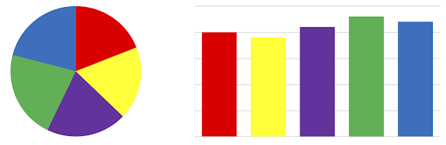
People find it much harder to judge the relative area of sectors than of rectangles (Burch & Weiskopf, 2014) - look at the same data below presented as a pie chart and then as a bar chart:
Perhaps it is time we moved away from using circle diagrams for teaching fractions altogether (see Foster, 2022)?
Questions to reflect on
1. How would you convince someone that the calculated position of the lines for a circle works just as well for any ellipse?
2. What do you see as the role of circle drawings like this for learning about fractions? Are other visuals (e.g. rectangles) preferable?
3. When is accuracy important and when isn't it?
Notes
1. I suppose you could also say that the division into sectors divides the circle (i.e., the circumference) into thirds, as well as divides the disc (i.e., the area) into thirds, whereas the parallel lines divide only the area into thirds.
2. Similar criticisms might be made about the value of training students to estimate angles in degrees with better accuracy. Tasks like this https://nrich.maths.org/1235 can be fun, but how important is this as a mathematical skill that is worth improving? I think that such tasks have value in gaining a sense of what 'one degree, ten degrees, etc.' look like, which seems as important as knowing what '1 centimetre' looks like.
References
Burch, M., & Weiskopf, D. (2014). On the benefits and drawbacks of radial diagrams. In E. Huang (Ed.), Handbook of human centric visualization (pp. 429-451). Springer.
Foster, C. (2015). Exploiting unexpected situations in the mathematics classroom. International Journal of Science and Mathematics Education, 13(5), 1065–1088. https://doi.org/10.1007/s10763-014-9515-3
Foster, C. (2022). Using coherent representations of number in the school mathematics curriculum. For the Learning of Mathematics, 42(3), 21–27. https://www.foster77.co.uk/Foster,%20Using%20coherent%20representations%20of%20number%20in%20the%20school%20mathematics%20curriculum.pdf


I very rarely draw circles for anything to do with fractions.
ReplyDeleteUsing a clock analogy, I don't expect students to easily say 0.1 of an hour is 6 minutes (try dividing a circle into fifths or tenths). But every lawyer and accountant knows how to bill in 6 min increments!