21 July 2022

Making rounding interesting

Are there any 'boring' topics in mathematics? Understandably, mathematics teachers tend to be kind of professionally committed to the idea that all mathematics topics are interesting. If even the teacher doesn’t find the topic interesting, then what hope is there for the students? And yet, perhaps, if we are completely honest about it, we find some topics a bit harder to be enthusiastic about. For me, ‘rounding’ is that kind of a topic. But can it be made interesting?

I wonder if rounding is any mathematics teacher’s favourite topic? Somehow I doubt it, although perhaps, following this post, lots of people will write in the comments that it is theirs, which would be interesting! Even if it perhaps isn’t the most exciting topic, it’s certainly one that contributes to success in high-stakes assessments. Students will be repeatedly penalised throughout their examination paper if they don’t correctly round their answers to the specified degree of accuracy, so it’s certainly something that needs teaching. Boring but important?

When I suggest that rounding is not a very intrinsically interesting topic, I am not talking about ‘estimation’. That is certainly something that can be extremely interesting and engaging. I really like beginning with some scenario, such as a jar of sweets, and asking students for their off-the-top-of-their-head guesstimates of how many there are, and then coming up with a variety of different ways to improve on this (Note 1). Ideally this leads to the notion that quicker, rougher estimates are not necessarily ‘worse’ than more accurate ones, and choosing the optimal level of accuracy depends on the purpose for which you need the estimate and how much time you have available and how much effort seems worthwhile. Level of accuracy needs to be fit for purpose. A good way to promote this is to ask questions like:

  • Which weighs more - a cat or 10,000 paperclips?
  • Which mathematics teacher in our school do you think is closest to being a billion seconds old?
    [Apologies, but I don't know where I first came across these examples - please say in the comments if there is someone I should acknowledge for these.]

In these, it is clear that your estimates only need to be accurate enough to answer the question. There is no point obtaining more accuracy than you need to do that.

But here I’m not thinking about contextual estimates like that but the more abstract kind of questions that you see in textbooks and on examinations, like:

Estimate the answer to $0.278 \times 73.4-\sqrt{48.3}$.

These questions that ask for ‘an estimate’ but don’t specify how accurate it should be are a bit nonsensical, it seems to me. You could always answer any question like this with ‘zero’, and the only hard part would be working out what degree of accuracy this was to (which the question never asks for). For example, the answer to this calculation turns out to be 13, to the nearest integer, so this would be 0 to the nearest 100, 0 to the nearest 1000, or (to be on the safe side) 0 to the nearest billion! Any point on the number line is always ‘close’ to zero if you zoom out far enough. So, you will technically never go wrong with a question like this by answering ‘0 to the nearest trillion’ – although of course mark schemes would not reward you for that!

More seriously, the usual approach that is taught within school mathematics is to round each individual number to 1 significant figure, with the possible exception of when you are about to find a root, where you might fiddle it to the nearest convenient number instead. So, in this example, although 48.3 would round to 50 to 1 significant figure, or 48 to 2 significant figures, we might instead choose to round it to 49, because $\sqrt{49}=7$. Doing that, we would get something we should be able to do easily in our head: $0.3×70-\sqrt{49}=21-7=14$.

The issue of how good our estimate might be (and therefore what it might be good for) is not really addressed at this level, and students would be expected simply to leave their answer as 14, without any idea how close this is likely to be to the true answer, or even whether it is an underestimate or an overestimate. But is this $14±1$ or $14±1000$ or what? This is really a bit strange, as, in any real situation, a lot of the value in estimating is in getting bounds. We may not care exactly what the answer is, but it is usually important to know that it is definitely between some number and some other number. Simply throwing back an answer like ‘14’, which we know is almost certainly not exactly right, without having any idea how wrong it is, doesn’t seem very useful. Usually, we are estimating a number in order to enable us to make some real-life decision – how much paint to buy, or how many coaches to order – and those all require us to commit to some actual quantity. So, really, I don’t want to know ‘roughly 14’ – I want to know ‘definitely between 10 and 20’ or definitely between 10 and 15. So perhaps we should teach it this way? (Note 2)

Then, we can consider that how much effort it is worth going to in order to get a more accurate estimate depends on how narrow I want my bounds to be. It’s foolish to act as though more accuracy is simply an absolute good. (Sitting down and calculating more and more digits of $\pi$ forever would not serve any useful purpose.) Sometimes, when peer marking, students will be told to give themselves more marks if their answer is closer to the ‘true’ answer, but I think this reinforces an unhelpful view of estimation. It also encourages students to 'cheat', by first calculating the exact answer, rounding this answer, and then constructing some fake argument for how they legitimately got it. If more accuracy were always better, we would always use a calculator or computer and get the answer to as high a degree of accuracy as we possibly could. But, with estimation, the sensible thing to do is to spend your effort according to how useful any extra accuracy would be in the particular context that applies. These seem to me the important issues in estimation, and they go largely unaddressed in the lessons on estimation that I see.

Exploring rounding

One way to make the topic of ‘rounding’ a bit more interesting is to begin to explore some of these issues. For example, in the calculation above, since (almost) all of the numbers were rounded to 1 significant figure, it might seem sensible to give the answer to 1 significant figure, which would be 10, suggesting that this means $10±5$. In this case, the exact answer to the original calculation (13.45537…) is also 10, to 1 significant figure, which is good, and there seems to be an assumption within school mathematics that almost has the status of a theorem:

Claim 1: If you round each number in a calculation to 1 significant figure, then the answer will also be correct to 1 significant figure.

However, there is no reason at all why this should be true, and you might like to consider what the simplest counterexample is that you can find. When can you be more confident using this heuristic, and when should you be more cautious?

***

A simple counterexample would be $3.5+3.5$, which comes to 8 if you round each of the 3.5s to 4 (to 1 significant figure) before you add them, but 8 is not the correct answer to 1 significant figure, because of course it should be 7.

A slightly more complicated scenario that might be worth exploring with students involves rounding two numbers in a subtraction, so we could begin with a question like this:

Estimate the answer to $14.2-12.9$.

(You might ask, "Why estimate something so simple, and not just calculate?", and the point of this is not to be a realistic rounding scenario, but a simplified situation to help us see what is actually going on with rounding.)

So, here's another claim:

Claim 2: If we round each number to the nearest integer, then the answer will be correct to the nearest integer.

Is this claim always, sometimes or never true?

Students will need a bit of time to figure out what the claim even means. Using the notation $[x]$ to mean “round $x$ to the nearest integer”, we could write:

$[14.2]-[12.9] = 14-13 = 1$

And $[14.2-12.9] = [1.3] = 1$.

So that checks out in this case.

So, in this notation, the question is:

When is $[a-b] = [a]-[b]$?

I think this is a potentially interesting task, where there is plenty to think about, but it also generates some repetitive but somehow acceptable routine practice. (I call such tasks mathematical etudes – see Foster, 2018). You might like to try it yourself before reading on.

***

Running through this for all possibilities of $14.x-12.y$, where $x$ and $y$ are single digits between 1 and 9, we find this situation: 
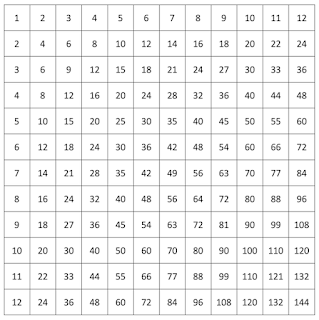
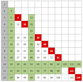
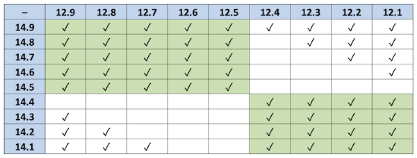
Table 1. $[14.x-12.y]$ and $[14.x]-[12.y]$ compared, where $x$ and $y$ are single digits between 1 and 9.
Ticks indicate where equality holds.

So, a counterexample to Claim 2 would be any of the empty cells in this table; for example, $[14.7-12.3] = [2.4] = 2$ but $[14.7]-[12.3] = 15-12 = 3$.

We might prefer to write this on one line as: 

$$3 = 15-12 = [14.7]-[12.3] ≠ [14.7-2.3] = [2.4] = 2$$

Applying some deduction, we might say:

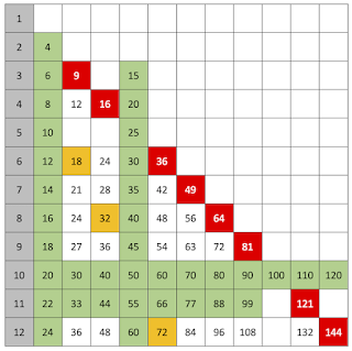
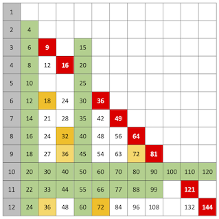
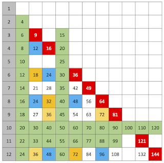
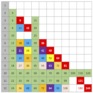
1. If both numbers in the subtraction are rounded up, or both are rounded down, we should get a tick. These are the ticks in the green squares in the table above.

We might also be tempted to say:

2. If one number is rounded up and the other number is rounded down, we should not get a tick.

As you can see from Table 1, this is false, as can be seen by the ticks in some of the white squares. Why does this happen? For example, in $14.3-12.8$, the minuend rounds down and the subtrahend rounds up, and we get no tick, since the difference, 1.5, rounds up to 2, whereas $14-13 = 1$. However, this doesn’t always happen. For example, in $14.2-12.8$, as before, the minuend rounds down and the subtrahend rounds up, giving $14-13 = 1$, but this time the difference is only 1.4, which rounds down to 1, so we do get a tick.

There is lots to explore here, and the idea of comparing the result from applying some function before and after some composition - i.e., $f(x \pm y) \stackrel{?}{=} f(x) \pm f(y)$ - is a highly mathematical question.

When I look back at mathematics tasks that I have designed over the years, I now notice that they often cluster around certain ‘favourite’ topics. Without meaning to, I have unintentionally avoided certain topics – perhaps those that, like ‘rounding’, seem intrinsically less interesting – and cherrypicked other topics to design tasks for. At Loughborough, we are currently working on designing a complete set of teaching materials for Year 7-9, so we are now working in the same kind of situation as teachers – we can’t miss anything out! And this has led me to thinking about how to address some of those potentially ‘less interesting’ topics, which is proving fun.

Questions to reflect on

1. Are there mathematics topics that you personally find less interesting to teach? Which ones? Why?

2. What tasks can make these topics more interesting for you and for your learners?

3. For rounding, what other tasks can you devise? Is $[a+b] \stackrel{?}{=} [a]+[b]$ an easier or harder problem? What about $[ab] \stackrel{?}{=} [a][b]$?

Notes

1. Dan Meyer is the expert at designing tasks like this; e.g., https://blog.mrmeyer.com/2009/what-i-would-do-with-this-pocket-change/; https://blog.mrmeyer.com/2008/linear-fun-2-stacking-cups/; https://www.101qs.com/70-water-tank-filling 

2. I think the various versions of the “approximately-equal sign” $≈$ are not really our friends here, because a statement like $13≈10$ doesn’t really have a precise meaning.

References

Eastaway, R. (2021). Maths on the back of an envelope: Clever ways to (roughly) calculate anything. HarperCollins.

Weinstein, L., & Adam, J. A. (2009). Guesstimation. Princeton University Press.

Weinstein, L. (2012). Guesstimation 2.0. Princeton University Press.


07 July 2022

A football on the roof

I am always on the lookout for 'real-life' mathematics that is of potential relevance and interest to students but where the mathematics isn't trivial and the context isn't contrived. Too often the scenario is of potential interest but the mathematics is spurious, and doesn't really offer anything in the actual situation that couldn't be done more easily without mathematics. It is not easy to find good examples, but I think this is one that might provide some opportunities to work on topics such as similar triangles and ratio.

Some students lost a football on a flat roof and wanted to know whether the ball had rolled off and fallen down behind the back of the building (i.e., gone forever) or whether it was worth climbing up to retrieve it (Note 1). There weren't any tall buildings nearby that they could access to get a good view of the roof. What they needed to know was how far back from the building they needed to stand so as to be sure that if the ball was there they would be able to see it.

"Can you see it?"
"No, but I just need to go back a bit further."
"If it was there, you'd be able to see it by now."
"I'm not sure."

In particular, going as far back from the building as possible, given the constraints of the surrounding buildings, did the fact that they couldn't see the football mean that it was definitely not there, or could it be that it was just not visible over the edge of the building (Figure 1)?

Figure 1. A football on the roof

This problem is reminiscent of lessons in which students determine the height of a tree near the school using a clinometer, but it feels somehow different. There is not usually any good reason for wanting to know the height of a tree, and it is usually hard to find any way to decide afterwards whether the students' estimates are reasonably accurate or not. In this case, there is a clear 'need to know' and, ultimately, when the site manager brings a ladder, the students would discover if they were right or wrong, so it feels as though something is at stake.

A good way to start would be to decide on simplifying assumptions that it seems sensible to make; i.e., things that we might sensibly choose to ignore. For example:

  • assume that the ground and all roofs are perfectly horizontal
  • assume that the roof in question is free from any debris
  • assume that the building has height 4 m and goes back 6 m
  • assume that the football is perfectly spherical, with diameter 22 cm
  • assume (worst-case scenario) that the ball is right at the back of the roof, against the brick wall

Students may suggest more outlandish things, such as assuming that light travels in straight lines or that the curvature of the earth is negligible, and I would include these as well if they raised them.

Figure 2. Careful analysis (diagram not drawn to scale)

Let's start with a careful analysis, which uses trigonometry and is 'a sledgehammer to crack a nut' for this simple scenario. This is not the approach that I would envisage students taking.

Lots of the work has been done in the diagram (Figure 2), and our units are metre throughout.

We have

$$\tan \theta = \frac{r}{l}$$

$$\tan 2\theta = \frac{h}{d}$$

Using the identity

$$\tan 2\theta \equiv \frac{2 \tan \theta}{1-\tan^2 \theta}$$

we obtain

$$\frac{h}{d}= \frac{2 \left( \frac{r}{l} \right) }{1- \left( \frac{r}{l} \right)^2},$$

giving

$$d= \frac{h(l^2-r^2)}{2rl}.$$

We can now substitute in some reasonable values:

  • $h=4-1.8=2.2$; the height of the building subtract the maximum eye height of the student when standing on tip toes or jumping,
  • $l=6-0.22=5.78$; the depth of the shed subtract the diameter of the football, and
  • $r=0.11$.

This gives $d=57.8$, so the student would just be able to see the top of the football from about 58 metre back from the shed.

But the trigonometry here is overkill for the nature of this problem and the accuracy required, so it would be much quicker and more reasonable to use the simplified diagram shown in Figure 3.

Figure 3. Rougher analysis (diagram not drawn to scale)

For this rougher analysis, we don't need to use $\tan$ explicitly and can just equate corresponding ratios in similar triangles.

So,

$$\frac{d}{h}=\frac{l}{2r},$$

giving that

$$d=\frac{hl}{2r},$$

so, with the same values as above, this again gives $d=57.8$, correct to 1 decimal place, and the same conclusion that the student would just be able to see the top of the football from about 58 metre back from the shed.

In the situation where $l  \gg r$, we can see that in our first equation

$$d= \frac{h(l^2-r^2)}{2rl}$$

the bracket $(l^2-r^2)$ will, to a good approximation, reduce to $l^2$, giving

$$d \approx \frac{hl^2}{2rl}=\frac{hl}{2r},$$

as before. So, all routes lead to an answer of about 58 metre.

But, what if the playground extends only, say, 40 metre before meeting another building? Would it be worth the students going inside and fetching a chair to stand on? Would that make enough difference to be worth the trouble?

The beauty of having derived a formula is that a question like this can be answered instantly by substitution. All that changes here is that $h$ reduces from 2.2 to, say, 1.7.

So,

$$d=\frac{hl}{2r}=\frac{1.7 \times 5.78}{2 \times 0.11}=44.7,$$

and so this would not quite be enough to work within the available space, since $44.7 > 40$. Rearranging the equation to give

$$h=\frac{2rd}{l}$$

reveals that, unless you can find a stool of height at least $2.2 -1.52 = 0.68$ metre, then there is no point bothering.

The mathematics here is not profound, but the result is not guessable without it. I think we need more tasks like this, where a little bit of mathematics (not pages and pages) tells you something practically useful that you couldn't have guesstimated accurately enough without it.

Questions to reflect on

1. Would your students find a task like this credibly realistic and engaging? How might you improve it?

2. What 'real-life' tasks do you use that are both non-trivial mathematically and non-embarrassing in terms of correspondence with reality?

Note

1. Disclaimer: Nothing in this post should be taken to endorse climbing onto roofs to retrieve footballs!

23 June 2022

Lines of not-very-good fit

Does anyone teach lines of best fit 'properly' in lower secondary school? I think whenever I’ve seen this concept taught, or taught it myself, it’s always been a bit wrong.

Typically, students are given a scatterplot, or they draw one themselves, and are asked to draw a straight line on top of it, by eye, but the instructions for how they are supposed to draw this line can be a bit vague. Maybe the teacher says something like, “The 'line of best fit' goes roughly through the middle of all the scatter points on a graph.” (BBC Bitesize: https://www.bbc.co.uk/bitesize/guides/zrg4jxs/revision/9) I guess this is kind of right, but I think that any student hearing this is bound to misinterpret what this is supposed to mean.

Suppose you give students the $x$-$y$ scatterplot below (Note 1), and ask them to draw the best straight line they can that takes account of all these points. 

Of course, they could draw something like this, which “goes roughly through the middle of all the scatter points” (10 points on either side).

But, unless they are trying to be awkward, they will probably be much more likely to draw something like this.

It 'goes through the middle' and is the kind of thing that the teacher is wanting (Note 2).

But, if you then display an accurate trend line, say using Excel (in black below), then it will be a bit off from what the students have drawn.

Here they are together, so you can see the difference:

It is easy to put this discrepancy down to human error. The computer draws the best possible line, and the line we draw by eye is bound to be not quite right. Students might over-attend to a few prominent outliers, rather than really base their line on where the overall mass of the points is located. So there is nothing to worry about.

But there is more than random error going on here. I claim that the students are not even trying to draw the line that the computer is drawing. For example, if we switch the variables around (interchange the axes), presumably this would/should make no difference at all to the line that the students are trying to draw, relative to the positions of the points – it should just be a reflection of their line in the diagonal $y=x$. But the computer will give you a completely different regression line, because the regression line of $y$ on $x$ is in general quite different from the regression line of $x$ on $y$ - and sometimes dramatically so. The regression line of $x$ on $y$ is shown in blue below, on top of the black regression line of $y$ on $x$.

The black line minimises the sum of the squares of the vertical distances of the points from the line, whereas the blue line minimises sum of the squares of the horizontal distances of the points from the line. We should not expect the resulting lines to be the same. The black line gives the best linear prediction of the $y$ value, given the $x$ value; the blue line gives the best linear prediction of the $x$ value, given the $y$ value. The two lines answer two different questions.

And neither of these questions is likely to be what the students are thinking about. The line the students are likely to be aiming for is the principal axis of the data. If we draw an ellipse around our data points, what the students are presumably trying to do is essentially find the major axis of this ellipse.


If we compare the principal axis (in red below) with the correct regression line of $y$ on $x$ (in black), we can see that they are not the same.

If you consider thin, vertical slices of the ellipse, the black line approximately bisects these, and is close to the mean $y$-value of the points that are near to that value of $x$. Relative to this, the red line underestimates $y$ for low values of $x$ and overestimates them for high values of $x$.

In school mathematics, lines of best fit are used to predict one variable from the other, so it's really regression lines that we need, not principal axes. (And, indeed, really we should use a different line to predict $y$ from $x$ [part (b) of the typical exam question, in which part (a) is to draw the line of best fit] from the line we use to predict $x$ from $y$ [part (c) of the typical exam question].) Even when the regression line and the principal axis happen to be close to each other, conceptually they are quite different. The principal axis minimises the sum of the squares of the (perpendicular) distances from the points to the line, whereas the ordinary-least-squares regression line minimises the sum of the squared vertical distances from the points to the line. It can be interesting to devise scenarios where these two lines are very similar and very different.

From a school teaching point of view, does this matter, or is it unnecessary quibbling? I have found that this discussion comes up sometimes when students complain that the line of best fit that the computer is producing ‘looks wrong’, especially when there are lots of points, and the correlation is fairly strong. They think they can draw a better one, and are puzzled why the computer is clearly giving them 'wrong' lines. The problem here is that the students have been misled about which line they should be aiming for, and Gelman and Nolan (2017, Chapter 4) have a nice approach to addressing this.

Maybe it is a relatively small point to worry about, but surely it would be a bit of a problem if students drawing something closer to the black line above were being penalised or criticised over those drawing something more like the red line.

Questions to reflect on

1. How concerned are you about this distinction between regression lines and principal axes?

2. What, realistically, might be done to address this in school-level mathematics?

3. Are there other examples in school mathematics where it is usual to teach things 'a bit wrong'?

Notes

1. The data used in this blogpost is available at: https://www.foster77.co.uk/Data%20for%20line%20of%20best%20fit%20blogpost.csv

2. Students sometimes have a strong tendency to avoid going directly through any of the points. They have been told that they are not meant to 'join up' the points, and, as if to prove this, they try to keep away from any actual points altogether. Similarly, they may feel that it would be wrong to allow the line to pass directly through the origin, so they act as though the origin must be avoided at all costs.

Reference

Gelman, A., & Nolan, D. (2017). Teaching statistics: A bag of tricks. Oxford University Press.


09 June 2022

Motivation for measurement

Optical illusions are almost universally intriguing. Young children can completely get them, but they can fascinate adults too. There is something captivating about being tricked by your eyes. And I think they can provide a great opportunity for motivating some geometry.

Topics in mathematics that involve accurate measurement can sometimes feel a bit unmathematical - more science than mathematics. For example, why is 'scale drawing' a topic in mathematics? Is this just a hangover from the days when 'technical drawing' was a marketable skill that was taught in schools? Converting scales is a useful application of ratio, but what is the mathematical purpose of making accurate drawings? Loci and construction are important topics for understanding concepts in geometry, and the central idea that compass constructions are 'exact in principle' seems to me to be important. But should it matter whether students can execute a perfect circle with their compasses or draw an angle of $35^\circ \pm 1^\circ$ using a protractor? Arguably, making neat constructions may depend more on the quality of the student's instruments (such as how well-tightened the screw on their compasses is) and on basic dexterity than on any mathematically-relevant skill. The beauty of mathematics is the ability to carry out exact calculations that mean that a correct mathematical sketch not drawn to scale is generally as useful as, or more useful than, an accurate scale drawing. For example, in an astronomical scenario (e.g., calculating the distance to the sun) we can sketch a 1 by 20,000 right-angled triangle, and this is much more helpful than trying to draw this to scale! In mathematics, we develop ways to calculate so that we don't need to make accurate drawings, so perhaps the main purpose of scale drawing is to show students how slow and tiresome things would be without mathematics (a Dan Meyer 'headache-aspirin' situation, see Meyer, 2015)?

Nevertheless, there are times when we need students to measure lengths and angles, and it is great when we can find purposeful ways to practise these skills (see Andrews, 2002). I think finding scenarios where there is a real (i.e., uncontrived) need to measure can be quite difficult, but optical illusions can be really helpful for this - and are fun in their own right.

There is a good list of many kinds of optical illusions at https://en.wikipedia.org/wiki/List_of_optical_illusions, and this includes things that are extremely weird, such as Ames room (https://en.wikipedia.org/wiki/Ames_room). These might be fun to look at and talk about. However, I focus below on some examples of optical illusions that could have obvious, immediate relevance in motivating some primary or secondary school geometry and measurement.

The Ebbinghaus illusion (https://en.wikipedia.org/wiki/Ebbinghaus_illusion) is a nice one. The orange discs below are equal in size, but don't look it.

This is just crying out for some measurement with a ruler. Can the diameters really be equal? But the centres of the circles are not marked, so how could you be sure you were accurately measuring the diameter, and not some other chord?

The Delboeuf illusion (https://en.wikipedia.org/wiki/Delboeuf_illusion) is similar. The black discs are in fact equal, but the right-hand one looks larger:

The Moon illusion is a nice variation on this (https://en.wikipedia.org/wiki/Moon_illusion).

Without being prompted to do so, when presented with these illusions, students reach for their rulers. And so, of course, if you want every student to do the measuring, then you need to provide the images on paper, as displaying them on the screen allows only one student to do it on behalf of everyone else.

Students could also attempt to create their own drawings, some of which are illusory (something looks bigger but isn't) and some not (something looks bigger and is), and see if other students can decide which are which by eye - followed by measuring to check.

The Müller-Lyer illusion (https://en.wikipedia.org/wiki/M%C3%BCller-Lyer_illusion) provides motivation for measuring the lengths of line segments. The two horizontal portions below are equal in length, but don't look it!

Similar opportunities are provided by the Ponzo illusion (https://en.wikipedia.org/wiki/Ponzo_illusion),

Tony Philips, National Aeronautics and Space Adm., Public domain, via Wikimedia Commons

the Sander illusion (https://en.wikipedia.org/wiki/Sander_illusion), where the two purple diagonals below are actually equal in length,
where the vertical line segment looks longer, but isn't.

Asking students to attempt to draw a square by eye, using a straight edge (i.e., not a scaled ruler), can be revealing. Then the students measure everyone's and do some statistics to see whether, among the various drawings produced, 'squares' that are tall/narrow are more prevalent than ones which are short/wide. (The easiest way of keeping track of the orientation of each piece of paper is to have the students write their name at the top.) There are similar opportunities for statistical analysis in devising a way to decide how to judge the quality of people's freehand circles (see Foster, 2015, and Bryant & Sangwin, 2011).

The café wall illusion (https://en.wikipedia.org/wiki/Caf%C3%A9_wall_illusion) is a bit more sophisticated, and this can be a good opportunity to encourage students to use precise language. What exactly do they mean by 'wavy', 'wonky' or 'not straight'? Do they mean sloping straight lines or curves? "Say what you see" can be a really a useful prompt to use with these figures, and you can follow up with requests for greater clarity.

Fibonacci, CC BY-SA 3.0 http://creativecommons.org/licenses/by-sa/3.0/, via Wikimedia Commons

The Zöllner illusion (https://en.wikipedia.org/wiki/Z%C3%B6llner_illusion) provides another opportunity for students to check parallelness,

Fibonacci, CC BY-SA 3.0 http://creativecommons.org/licenses/by-sa/3.0/, via Wikimedia Commons

and the Hering illusion (https://en.wikipedia.org/wiki/Hering_illusion) is another example:

Fibonacci, CC BY-SA 3.0 http://creativecommons.org/licenses/by-sa/3.0/, via Wikimedia Commons

For working with polygons, the Ehrenstein illusion (https://en.wikipedia.org/wiki/Ehrenstein_illusion) is useful. What do we need to check to see if the shape really is a square? Is it enough just to measure the lengths of the four sides? Is it enough just to check that the angles are all right angles (and how many do we need to measure to do this?)? (The Orbison illusionhttps://en.wikipedia.org/wiki/Orbison_illusion - provides similar opportunities.)

Often, students address measurement objectives by spending lesson time measuring arbitrary line lengths or angles on a sheet, merely to improve their skill at measurement. Optical illusions can provide a rich context for doing similar work, where there is a motivation to discover whether, say, two lengths really are the same or not. I find that students will measure much more accurately, and with considerably more enthusiasm, when it has some purpose behind it, and I would call tasks like these mathematical etudes (http://www.mathematicaletudes.com/) for measurement.

Questions to reflect on

1. Do you find these optical illusions engaging? Would your students?

2. How could you use these ideas to promote a need for measurement with one of your classes?

3. What other tasks make measurement a meaningful mathematical activity?

References

Andrews, P. (2002). Angle measurement: An opportunity for equity. Mathematics in School, 31(5), 16–18. https://nrich.maths.org/content/id/2855/AngleMeasurement.pdf

Bryant, J., & Sangwin, C. (2011). How round is your circle? Princeton University Press.

Foster, C. (2015). Exploiting unexpected situations in the mathematics classroom. International Journal of Science and Mathematics Education, 13(5), 1065–1088. https://doi.org/10.1007/s10763-014-9515-3

Meyer, D. (2015, June 17). If math is the aspirin, then how do you create the headache? [Blog post]. https://blog.mrmeyer.com/2015/if-math-is-the-aspirin-then-how-do-you-create-the-headache/

26 May 2022

Are two cars better than one?

So many ideas in probability are really quite unintuitive. How can we help learners make better sense of how simple probabilities combine, without relying on arbitrary rules and mysterious formulae?

I recently heard someone talking about whether they should get a second car for their household (Note 1). They were doubtful that it was a good idea. In addition to the cost and environmental impact, they said, “If you have two cars, there’s twice as much chance that something will go wrong with one of them.” This seemed self-evidently true, and everybody nodded sadly, and the conversation moved on.

I began thinking about how I might respond mathematically. I knew what they meant, and their statement might indeed be approximately true, but it couldn’t be exactly true. Even if all that you know about probabilities is that they are capped at 1 (i.e., 100% is the highest possible probability), it is clear that you cannot just go around doubling probabilities. Doubling any probability greater than 0.5 will give you a total probability greater than 1, which is impossible. And, even if you have super-reliable cars with a very small probability $p$ of failing, you would only need to ensure that you buy more than $\frac{1}{p}$ of them for the total probability to exceed 1.

So, why is such a plausible-sounding statement not right? And under what assumptions might the statement be approximately true?

Suppose that both cars have the same probably $p$ of ‘something going wrong with them’ in a certain time interval. Would these be independent events? If both cars are parked outside the same house, then they are likely to be subject to similar weather conditions and other factors, so it seems unlikely that failure of one would be completely unrelated to failure of the other. But let’s ignore this and suppose that the two events are independent, and also that the two cars are equally likely to fail. This would mean that the probability of both cars failing would be $p^2$. And this means that when we double $p$ we are overcounting by $p^2$ (see Figure 1), because we are counting the same situation of ‘something goes wrong’ when car A fails and counting it again when car B fails, for those occasions when they both fail. In the extreme case, where you had two completely useless cars, you would have a 100% chance of not being able to drive anywhere, but not a 200% chance! Now, if $p$ is very small, then $p^2$ will be very very small, and so we can perhaps ignore the overlap region. But, if $p$ is not very small, then $p^2$ will be non-negligible. This means that the correct probability for either (or both) cars failing is $2p-p^2$. 

Figure 1. $p(A∪B)$

Looking at the expression $2p-p^2$, we might wonder whether we can be absolutely sure that it is always less than 1 for all values of $p$. Is the $p^2$ definitely always sufficiently large to bring back $2p$ to below 1 whenever $p>0.5$? One way to see this is by completing the square, to obtain $1-(1-p)^2$, meaning that $2p-p^2$ is equal to '$1-$something that is never negative'. Figure 2 shows the graph $y=2p-p^2=p(2-p)$, and the curve has its maximum value of 1 at $p=1$, and so it never exceeds 1 for any value of $p$ (Note 2).

Figure 2. $y=2p$ and $y=2p-p^2$

We can also see in Figure 2 that the line $y=2p$ is indeed a good approximation to the curve for small values of $p$. So, just doubling the probability is a reasonable approximation if you are considering very reliable cars.

Using the algebra, this reasoning is quite straightforward for anyone comfortable with quadratics and elementary probability. In probability, we can only add the probability of events A and B if they are mutually exclusive (i.e., $p(A∩B)=0$), so that the ‘Venn diagram identity’ $p(A∪B)\equiv p(A)+p(B)-p(A∩B)$ reduces to $p(A∪B)=p(A)+p(B)$. In other cases, we have to subtract the intersection, so as not to double count it.

I was happy with all of this, but I wanted to say something that didn't sound technical or rely on set theory or even Venn diagrams. Could I say in words why doubling was not quite right? I found it hard to come up with a good way to explain to my friend why the possibility of both cars going wrong was relevant to their statement, and why this indeed made their statement technically wrong, even if you were willing to make assumptions about things like independence and so on. If I had said that having two cars that might go wrong is not quite twice as bad as having one car that might go wrong, because, at least some times, both cars will simultaneously go wrong, I think they would be quite surprised! The commonsense response is that there is no consolation in having both cars fail on the same day - that is the worst possible nightmare, and indeed one of the reasons for contemplating having a second car was to try to be sure that they would always have one working car! They would probably respond that “When I said 'either-or', I was including 'both'!”, which misses the point. Yes, we want to include the chance of both cars failing - the point is that we want to include that possibility only once, not twice (Figure 3)! It is still true that $p^2<p$, and possibly dramatically so ($p^2 \ll p$), so the chance of having at least one working car has indeed risen from $1-p$ to $1-p^2$. The point is that if last week Car A failed, say, on Monday, Thursday and Saturday, whereas Car B failed on Tuesday, Saturday and Sunday, our daily frequency of car trouble would have been $\frac{5}{7}$ and not $\frac{6}{7}$, because we don't double count Saturday just because it was a double-failure day.

Figure 3. $(A∪B)-(A∩B)$

Perhaps this is part of a broader theme in mathematics of situations in which things can’t be simplistically added up. Other examples could include vectors that are not in the same direction, numerators of fractions that have different denominators, and dimensionally-incompatible quantities, such as distance and time (Foster, 2019). However, there is something particular about probability for me. I enjoy probability very much, but I think it's the area of mathematics in which I'm most likely to struggle to truly make sense or to be able to explain concepts clearly to others without using technical language and symbols (see Foster, 2021). Rarely when I'm doing a probability calculation do I have a rough ballpark estimate of the answer I should be getting, and, if I obtain an answer like $\frac{127}{351}$, it would be scarcely worth my while converting it to a decimal to see if it looked a 'reasonable' size, as I would have no idea how to tell reasonable from unreasonable. Do other people share this sense?

Questions to reflect on

1. Do you have a better way of explaining why doubling is invalid here?

2. Do you have other examples of 'similar' situations to this?

3. Do you share my sense that probability is often 'harder to explain' than other areas of mathematics?

Notes

1. With apologies for the highly 'middle-class' nature of this 'first-world problem'!

2. The expression $1-(1-p)^2$ can also be obtained intuitively by saying that the required probability is the complement of the probability that both cars are working properly. Since the probability that either car is working properly is $1-p$, the probability that both (assumed independent) work properly is $(1-p)^2$, and so the probability that this is not the case must be $1-(1-p)^2$.

References

Foster, C. (2019). Questions pupils ask: Why can’t it be distance plus time? Mathematics in School, 48(1), 15–17. https://www.foster77.co.uk/Foster,%20Mathematics%20in%20School,%20Why%20can't%20it%20be%20distance%20plus%20time.pdf

Foster, C. (2021). In a spin. Teach Secondary, 10(1), 11. https://www.foster77.co.uk/Foster,%20Teach%20Secondary,%20In%20a%20spin.pdf


12 May 2022

Learning times tables efficiently

Times tables can be a controversial subject. Can we help students to learn their tables in ways that promote conceptual understanding? This is my take on teaching times tables. I imagine there will be some strong opinions...

For many children, learning the times tables feels like a huge mountain to climb. And for those who have tried and feel that they have failed, going back and trying again fills them with dread. Perhaps all seems to go well in the beginning, with the 2s, 5s and 10s, say, but before long we reach the 6s, 7s and 8s, and it feels like every new fact that is mastered displaces an old fact that then becomes lost. As more and more facts are covered, the potential for muddling them up increases (e.g., $7 \times 8$: Is it $54$, or maybe $48$?), until the student really doesn’t have much idea which things they know and which they don’t. In the worst-case scenario, the only thing the child really trusts is skip-counting up from zero every time. And with skip-counting you only have to make one mistake for all of your remaining numbers to be wrong.

Teachers are highly strategic in the order in which they teach the tables: often 2s, 5s, 10s, 4s, … etc. But the effect of this is that the ‘hard stuff’ (6s, 7s, etc.) is delayed, so that when it arrives it can feel overwhelming and as though it is coming at learners far too quickly. I am not sure that learning one table after another like this – however carefully planned the sequence – is ideal (Note 1).

Here is a different way, that tries to build up from the multiplicative connections between the facts and deliberately avoids any addition/subtraction/skip-counting approaches, so as to build on the multiplicative structure of the tables and work more in harmony with that.

At first sight, there are 144 facts to learn: 


But, of course, this is highly deceptive, and it is nowhere near as bad as this. Because of the commutativity of multiplication ($a \times b \equiv b \times a$, see Foster, 2022), we can immediately delete nearly half of these facts: 

Everyone knows their 1-times table (which is almost as easy as the 0-times table, Note 2), so we can grey those out. And I will assume that the 2s (the even numbers), 5s, 10s and 11s (at least up to $9 \times 11$) are also known, or easily learned, and so I’ve marked those in green below:

So, from the original 144, this now leaves just 30 which need some teaching. And these are the tougher ones. Because of how the picture looks at this point, the best way to tackle this, I think, is not to go table by table (Note 3), but to exploit the structure a bit more strategically. In particular, we want to begin with the highest-leverage multiplication facts – the ones that help most with getting others. When students arrive, say, at secondary school and clearly ‘do not know their tables’, it is basically these 30 that are the problem. Convincing them that their difficulty is not a functionally infinite number of unknown facts but a relatively small number can be helpful. (It really is not like having to memorise a telephone directory!) And starting with the ones most likely to be of immediate help seems to make sense.

Big claim: The most useful of these remaining products to know are the eight squares in red below:

In desperate circumstances, where students have repeatedly tried without success to master tables, I have been known to (reluctantly) settle for just knowing the squares. The beauty of the squares is that they march diagonally through the table, and so they really take you deep in amongst all the difficult facts. If you know the squares, the difficult products you don’t know are often only a step away.

For example, if you know that $8 \times 8 = 64$, then $7 \times 8$ must be $64-8 = 56$.
Or, if you know that $7 \times 7 = 49$, then $7 \times 8$ must be $49+7 = 56$.

So, the squares are really high-leverage facts to know, and I wouldn’t do anything else on the multiplication facts until the student knows these 8 squares. However, I am not really advocating pushing things like $7 \times 8 = 8 \times 8-8$, because students find this reasoning hard (Do I subtract 8 or 7?), and it breaks with the multiplicative theme.

So, instead, I would build differently from the squares:

$6 \times 3$ is half of $6 \times 6$ or double $3 \times 3$
$4 \times 8$ is half of $8 \times 8$ or double $4 \times 4$
$6 \times 12$ is half of $12 \times 12$ or double $6 \times 6$

This is really powerful. Mental doubling and halving may need some work, but that is very important anyway, so I am happy to be dependent on that (see Francome, 2020).

So, now we have three more facts, in orange below:

Knowing that $6 \times 6 = 36$ is the single most powerful fact in the entire tables square, so long as you are able to mentally break down the 6s into 2s and 3s. Students who haven’t had much practice doing this ‘prime decomposition’ find it initially difficult, but this is at the heart of how multiplication works, so is an important awareness, and, with practice, it allows students to see why all the 36s in the table are equal (there are no 'coincidences' in the multiplication table):

$4 \times 9 = (2 \times 2) \times (3 \times 3) = (2 \times 3) \times (2 \times 3) = 6 \times 6 = 36$
So, $8 \times 9 = 2 \times 4 \times 9 = 2 \times 36 = 72$ and
$3 \times 12 = 6 \times 6$ (double the 3, halve the 12) $= 36$

These are in gold below:

Next, I would do 12, 24, 48 and 96. If you learn that $3 \times 4 = 12$ (which most students will know), then $3 \times 8$ (double the 4), $6 \times 4$ (double the 3), $12 \times 4$ (double the 3 twice), $6 \times 8$ (double the 3 and double the 4) and $12 \times 8$ (double three times) all come along without too much trouble if students are fluent doublers - and only the the last one of these involves any 'carrying' when doubling.

This means that when students are stuck on $6 \times 8$, the prompt would not be to count up in 6s or work from the nearest multiple of 6 or 8 they can think of (e.g., $6 \times 10$). It would be: Do you know $ \textit 3 \times \textit 4$? (Both numbers are doubled, so the answer must be 12 double-doubled, which can be done easily mentally, without any 'carrying'.)

These six are in blue below, so, by this point, we have dealt with 20 of the tricky ones and there are just 10 left.

The remaining ones are all ‘hard’, and we need to take time and care over these. I think I would spend 50% of my total energies on these 10.

There is 21, 42, 84 and 63 (in purple below), which all come from $3 \times 7$, which therefore needs to be learned. Then, given $3 \times 7$, we can do $6 \times 7$ (double), $12 \times 7$ (double twice) and $9 \times 7$ (triple). (None of these scalings is hard to do quickly mentally, as none involves any 'carrying'.)

Then there is 28 and 56 (in yellow below), where $8 \times 7$ is just double $4 \times 7$ (which is just double $2 \times 7$).

And then we have 27, 54 and 108 (in pink below), which come from $3 \times 9$, which needs to be learned (perhaps as $3^3$). We have $6 \times 9$ (double) and $12 \times 9$ (double twice).

Which just leaves 132 to remember (or know as $11^2 + 11$, which is possibly easier than double $6 \times 11$). I think this is probably the least connected of all of the multiplication facts, and so perhaps the hardest to remember.

So, in conclusion, this means that the only ones that potentially 'need' memorising are these 12:

$3^2, 4^2, 6^2, 7^2, 8^2, 9^2, 11^2, 12^2, 3 \times 4, 3 \times 7, 3 \times 9$ and $11 \times 12.$
And, if you have the 3-times table, then that reduces this list to just the other 7 squares and $11 \times 12$, which really feels manageable. It does show the power you get from knowing the squares (Note 4).

I think the key to supporting all of this is in the kind of prompts that you provide when a student is stuck. Rather than asking them to figure it out from ‘anything relevant that you know’, or waiting patiently while they skip-count up from zero, with this approach you have a clear plan for how they might be getting from known things to unknown. With practice, figuring out something like $7 \times 8$ by saying ‘double $7 \times 4$, which is 28, so that's 56’ can be extremely quick, and the more you do this the more you are incidentally practising doubling. (And this is one of the trickiest ones, because doubling 28 involves a mental 'carry'.) Of course, nothing will be as fast as ‘just knowing’, but, where that has repeatedly failed for a student, then this kind of approach may help. And I would teach it to everyone for the sake of understanding the multiplicative connections (Note 5). I certainly prefer to spend energy on this than on those one-off mnemonics, like ‘5-6-7-8’ for $56 = 7 \times 8$, which are flukes that don't generalise.

Here is my attempt at a (rather messy) summary of where everything comes from (pdf version):

In conclusion, I am not suggesting that any of this is easy, especially with students who have experienced repeated failure with tables or have developed ‘tables anxiety’. There is no quick, easy fix. And I’m not saying that I think this approach is definitely the best (e.g., I don’t make anything much of the 9s, which can be fairly easy to learn). But, I think that if you work through in this order you at least get the highest-leverage facts (e.g., the squares) before the lower-leverage ones (e.g., $11 \times 12$). However, if you have a better order - or entire approach - please put it in the comments below!

Questions to reflect on

1. What are your best strategies for teaching the multiplication tables? Do you work differently with older learners who have previously been unsuccessful learning their multiplication tables? 

2. What are the pros and cons of the different approaches you have tried? 

3. What do you think of the scheme I have outlined above? Please respond in the comments if you can improve on it.

Notes

1. For some great tables tasks that focus on conceptual understanding, see Faux (2018). See also the Position Statement on 'The Teaching and Learning of Multiplication Bonds' from the Joint ATM/MA Primary Group: https://www.m-a.org.uk/resources/1multiplicationbondsATMMA.pdf

2. Of course, except for the $1 \times n = 1 + n$ error, which seems to be particularly common with $1 \times 1 = 2$.

3. In the time of the Numeracy Strategies in the UK, everyone seemed to be chanting up and down in multiples on 'counting sticks', but I worry that that doesn't always help learners to remember which numbers belong in which tables. Once you move on to a new table, you trample all over numbers that have been learned in previous tables, with different but similar numbers appearing, and this interference makes it highly muddling for many students. It also feels 'additive' rather than 'multiplicative'.

4. Of course, some of the squares in this list could be derived from others in the list (e.g., $6^2$ is double-double $3^2$), but I tend to think that they are all important enough to know in their own right. But, if you disagree, then you could further reduce the list of base facts to just these nine: $3^2, 4^2, 7^2, 9^2, 11^2, 3 \times 4, 3 \times 7, 3 \times 9$ and $11 \times 12$, and get everything from just them.

5. The other advantage of 'just knowing' the tables, rather than working them out (even very quickly) is, of course, that you can work backwards, and when you see, say, 56, you immediately think 7s and 2s ($2^3 \times 7$). I think the kind of approach I've outlined here, focused on scaling up, rather than repeated addition, potentially helps with this, because, when you see 56, you are more likely to think 'double 28', and that can take you back to $14=2 \times 7$ and, via $4 \times 7$, to $8 \times 7$, so all the 'reverse doubling' helps to make visible the multiplicative structure that is there. Whereas thinking that 56 may be 7 or 8 more or less than some other half-remembered number doesn't do much for you.

References 

Faux, G. (2018). Tables together. Association of Teachers of Mathematics.  https://www.atm.org.uk/shop/act114pk/Tables-Together-e-book/DNL170

Foster, C. (2022). Getting multiplication the right way round. Mathematics in School, 51(2), 16–17. https://www.foster77.co.uk/Foster,%20Mathematics%20in%20School,%20Getting%20multiplication%20the%20right%20way%20round.pdf

Francome, T. (2020). Random chants: Generating a lot from a little using Excel. Mathematics Teaching, 274, 28-30.


28 April 2022

Tangible contexts for mathematics

Do contexts help students to understand mathematics or do they just make it harder for them to untangle the mathematics from all the extraneous information? I think the answer is yes – both of these happen on different occasions. So, what is it that gives some contexts the potential to be powerfully illuminating?

I think the answer is not ‘relevance’ to a student’s personal interests. Relevance might be motivating, possibly, but it doesn’t necessarily make the context more illuminating of the mathematics. That way lies a ‘learning styles’ kind of fallacy, that every student needs a different context that is just right for them, and the magical right context will somehow make everything clear to them. I don’t think that’s right. And anyway, students often seem more switched on by contexts that take them out of their existing worlds (e.g., spaceships, dinosaurs, unicorns) than those which merely reference things they are already familiar/bored with. So I don't think matching personal interests is the most helpful approach. I think it's more likely that generally most students are helped by the same illuminating, well-chosen contexts, and not really so much by others. 

Ratio and multiplicative/proportional reasoning

Let’s take ratio or proportional/multiplicative reasoning as an example. This is widely acknowledged to be a (or possibly ‘the’) central concept in lower secondary mathematics. And something that many students really have a weak grasp of. If you wanted a concrete context to help students make sense of this area, what would you pick? If you opened a textbook at the ‘ratio’ chapter, what contexts would you expect to find?

Of course, ratio can be applied to all sorts of contexts, and it is important to do this and let students see how ratio can be relevant and important in a wide range of areas. That is fine. But what I am thinking about here is contexts that are deliberately used to try to develop students’ understanding of what ratio is and how it operates.

The problem for me with, for example, money as context is that if the ratio of money spent by, say, Usha and Sam is 3:1, and the ratio of money spent by Dave and Priya is also 3:1, it is quite hard to capture in words (or in pretty much any other way) what specifically it is about Usha/Sam and Dave/Priya that is the same, given that these ratios are the same. The ‘same ratio’ is a highly abstract concept here. So, although I think that money might at some point be a worthwhile context for using ratio, I don’t think it’s helpful for understanding what ratio is. My test is that I need to be able to complete the sentence: “When the ratios are the same, the _____ is the same” with something highly tangible and familiar (not mathematical) going into the blank space. For this reason, I think that most discrete ratios (money, different coloured beads on a string, different kinds of animals on a farm, boys and girls in a class, etc.) are not so useful.

Tangible context: paint

Instead, I think the ratios of continuous quantities are much more useful to begin with, and, in particular, my go-tos are always drinks (Foster, 2007) and paint. The fact that most students probably never mix their own drinks, and even professional decorators rarely mix pots of paint together to make new colours (and when students mix their paint in art, this would be by eye) is irrelevant. The point of the context is not that it’s something students do every day, or even ever. The point is that it’s easy to imagine (what Realistic Mathematics Education calls 'realistic', and which means something closer to 'realisable').

The reason that I think these contexts are useful is that:

  • “When the ratios of red paint to white paint, say, are the same, the paint is the same colour.” and
  • “When the ratios of orange juice to lemonade, say, are the same, the drinks taste the same.”
And everyone knows what these things mean. This means that you can have a discussion about various hypothetical mixtures of red and white paint, or fizzy orange, and you can initially completely avoid the word ratio and any 'rules' about when 'ratios' are or aren’t equal. You can just ask: “Would they be the same colour?” or "Would they taste the same?", and everyone knows what you mean and can engage in the thinking that you want them to do.

With paint, I find that having the two colours as red and white is particularly useful, because you then have the word ‘pink’ available, in addition to talking about ‘redness’ and ‘darker/lighter’. This all helps the discussion to focus initially on the mathematical thinking, rather than terminology. Once students appreciate that 2:3 and 20:30 and 1:1.5 and 4:6 are all ‘the same colour’, then it is natural to try to capture this ‘sameness’, and we can use a word like ‘ratio’ to do so. But doing it the other way round, beginning by stating that 'We say that' 2:3 and 20:30 and 1:1.5 and 4:6 are all ‘the same ratio’ invites students to ask, “What do you mean?” And that puts the teacher in the position of having to do the justifying, whereas really you want the students to be doing this, based on something that they have already gained a sense of.

Tangible context: fizzy orange

For the same reason, making fizzy orange using orange juice and lemonade can be another really illuminating context (and you could possibly even do this one for real in the classroom, Foster, 2007). Lemonade is better than water, I think, not just because the mixture tastes better, but because then you can ask, “Which mixture will be fizzier?” as well as “Which mixture will be more orangey?” Really tangible contexts like these do a lot of the work for you. Every child knows that adding more orange juice won’t necessarily make the mixture taste more orangey, if you are also adding more lemonade.

I would often begin a discussion of this scenario by suggesting a few possible mixtures of orange juice and lemonade (as in the table below), and asking students which mixtures would taste the same, and which would taste different. For any ones that they think would taste different, I would ask them which would taste more orangey, and I find that that sometimes causes them to change their minds. You often get to a situation where they think one mixture would taste more organgey, but also more fizzy, and so that causes them to go back and think again.As the discussion progresses, further possible mixtures are usually suggested by the students, and I would add these to the list. The point is to avoid telling students whether they are right or wrong, but to draw on their common sense and life experience to let them figure it out. They know everything they need to know to do this. This then forms a really good basis for more formal teaching of ratio.

For example:

Teacher: Would any of these mixtures taste the same? Are there any you’re sure would taste different?
Student 1: D and E would taste different.
Teacher: Why do you say that?
Student 1: D would taste stronger than E because there’s less lemonade in it.
Teacher: But D and E have the same amount of orange, don’t they, so shouldn’t they be equally orangey?
Student 2: No, because the orange is spread out in more lemonade in E.
Teacher: Can someone else explain what S2 is saying?
...
Teacher: Would any of these mixtures taste the same as each other?
Student 3: A and B would taste the same.
Teacher: Why do you say that?
Student 3: Because they both have 1 more lemonade than orange.
Teacher: Are there any other mixtures with 1 more litre of lemonade than orange?
Student 4: Mixtures C and D.
Teacher: So, would mixtures A, B, C and D all taste the same?
Students: Yes.

It’s likely at this point that some student will raise some doubt, perhaps relating to C being ‘nearly fifty-fifty’. Multiplicative language or thinking tends to appear around this point, if it hasn't already, which can then develop into getting the students to order A, B, C, D and E by ‘orangeyness’.

If this doesn't happen, then the teacher can be more proactive:

Teacher: Suppose I took two containers of Mixture A. How many litres would there be in each?
Student 3: 5 litres.
Teacher: What would happen if I mixed them together?

Every student will appreciate that mixing identical mixtures will lead to twice as much mixture, but that it will taste exactly the same. So this gives us Mixture E. And students will have already agreed that Mixture E must be less orangey than Mixture D, so this provides the nudge for everyone to think more deeply. Mixtures A and D can't taste the same if mixtures A and E taste the same and mixtures D and E don't! The idea that mixing 'identically-tasting mixtures' (still avoiding the use of the word ‘ratio’) will lead to a new mixture with exactly the same taste is highly intuitive, and nobody will ever doubt this. And that kind of knowledge is all that is needed to develop all the necessary ideas of ratio through this kind of discussion.

Tangible context: chromatography

Finally, I think a really helpful science context is chromatography and retardation factor ($R_f$) values (Note 2). There could be potential for some cross-curricular practical work with chromatography paper and water-soluble marker pens. Different inks dotted along a pencil line at the bottom of a sheet of chromatography paper will move at different rates as the solvent soaks up the sheet (Figure 1). Each component will travel at a fixed fraction of the speed of the solvent, and the $R_f$ value of each is defined as

$$R_f = \frac {\text{distance travelled by the substance}} {\text{distance travelled by the solvent}}$$

Figure 1. Calculating the $R_f$ for the red substance.

This seems to me like a perfect, dynamic scenario for understanding ratio, because molecules of a substance are highly obliging, and obey the rules perfectly (unlike, say, two runners in a race, running at different speeds, who need to negotiate bends and are likely to get tired at different rates). Here, when the ratio is the same, the height above the baseline on the chromatogram is the same (and the substance is likely to be the same). I would be keen to hear from anyone who has used this context as a way to explore ratio with students.

Questions to reflect on

1. What examples of illuminating contexts do you use - for ratio, or for other topics? What is so good about them?

2. When do you feel that contexts do and do not work well? Why?

Notes

1. For a free lesson plan based on the fizzy orange idea, see https://www.map.mathshell.org/lessons.php?collection=8&unit=6230

2. People's recent familiarity with Covid lateral flow tests may also make this easier to grasp.

Reference

Foster, C. (2007, May 24). Make maths sparkle. SecEd, 12. https://doi.org/10.12968/sece.2007.5.902. Available at https://www.foster77.co.uk/Foster,%20SecEd,%20Make%20Maths%20Sparkle.pdf

Teaching specific tactics for problem solving

This is my final blogpost, as my year as President of the Mathematical Association draws to a close, so I've allowed myself to go on at ...